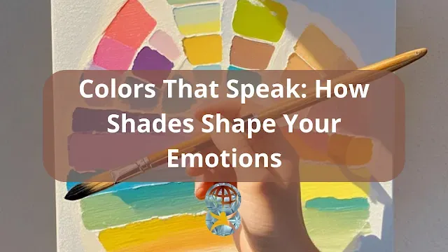
Imagine walking into a room painted in soft blue tones, instantly feeling calm and relaxed. Now, think about stepping into a space filled with bright reds and oranges, evoking a sense of energy and urgency. This is the power of color psychology—a field that explores how colors influence human emotions and behavior.
 |
| The Science of Color Psychology: How Colors Influence Emotions & Design Meta |
How do colors affect our moods and decision-making?
Why do artists and designers carefully choose color palettes?
How can you use color psychology in daily life?
This article delves into the science behind color psychology, its impact on emotions, and practical applications in art, design, and marketing—supported by the latest research and expert insights.
How Colors Influence Emotions
Warm Colors: Energy and Passion
Warm colors like red, orange, and yellow are often associated with excitement, passion, and energy. These colors can:
- Increase heart rate and stimulate appetite.
- Create a sense of urgency, making them popular in sales and marketing.
- Evoke feelings of warmth and happiness when used in balanced tones.
Scientific Insight: A 2022 study published in The Journal of Applied Psychology found that red enhances attention to detail and increases physical performance, making it a powerful color in sports and branding.
Cool Colors: Calmness and Trust
Cool colors like blue, green, and purple are known for their calming and stabilizing effects. These colors can:
- Reduce stress and promote relaxation.
- Enhance focus and productivity, making them ideal for office spaces.
- Evoke trust and reliability, which is why many financial and tech companies use blue in their branding.
Example: A study from Frontiers in Psychology found that hospital rooms painted in soft green and blue tones contributed to faster patient recovery rates.
Neutral Colors: Balance and Sophistication
Neutral colors such as white, gray, and black serve as a foundation in design. They can:
- Create a sense of elegance and modernity.
- Provide balance when paired with vibrant colors.
- Evoke simplicity and minimalism, popular in contemporary branding.
Real-World Example: Luxury brands often use black and white color schemes to convey sophistication and exclusivity.
The Role of Color Psychology in Art and Design
Artists and Emotional Expression
Artists use color to communicate emotions and narratives without words. For example:
- Van Gogh’s "Starry Night" uses blues and yellows to convey both tranquility and emotional turbulence.
- Pablo Picasso’s "Blue Period" features cool, melancholic tones to reflect sadness and introspection.
Designers and User Experience
In design, colors shape user perception and behavior. Consider these applications:
- Web Design: Blue enhances trust in financial websites, while red is used for call-to-action buttons.
- Interior Design: Warm hues make dining spaces feel inviting, while soft greens create a spa-like atmosphere.
- Marketing: Brands like McDonald's use red and yellow to stimulate appetite and excitement.
Pro Tip: When designing, consider cultural differences—while white symbolizes purity in Western cultures, it represents mourning in some Asian cultures.
How to Use Color Psychology in Daily Life
Choosing Colors for Your Space
Bedroom: Soft blues and lavenders promote relaxation and sleep.
Workspace: Green and light yellow enhance focus and creativity.
Living Areas: Warm neutrals create a welcoming and cozy ambiance.
Dressing with Color Psychology
Red: Exudes confidence and power, great for presentations.
Blue: Builds trust and calmness, ideal for interviews.
Black: Represents elegance and professionalism, suitable for formal events.
Applying Colors in Branding & Marketing
Fast Food Chains: Use red and yellow for appetite stimulation.
Luxury Brands: Favor black, white, and gold for exclusivity.
Eco-Friendly Brands: Green is commonly used to signify sustainability.
Common Myths About Color Psychology
Myth 1: "Colors Affect Everyone the Same Way."
Truth: Color perception varies based on personal experiences and cultural background.
Myth 2: "One Color Fits All Purposes."
Truth: The impact of a color depends on context and surrounding colors.
Myth 3: "Black Is Always Depressing."
Truth: While associated with mourning, black also symbolizes luxury and power in fashion and design.
Success Stories & Real-Life Examples
Emma’s Artistic Transformation: Using color psychology, she redesigned her studio with blues and yellows, improving her creativity and mood.
David’s Branding Success: His company rebranded with a green and white color scheme, reinforcing its eco-friendly mission and attracting more customers.
Lisa’s Home Makeover: Incorporating earthy tones in her home made the space feel more grounded and serene.
Conclusion: Harness the Power of Color Psychology
Colors have a profound impact on emotions, behavior, and decision-making. By understanding color psychology, you can make intentional choices in art, design, and everyday life.
Take Action Today:
Experiment with colors in your workspace and home.
Choose clothing colors that align with your goals.
Use color strategically in branding and marketing efforts.
References & Sources
Harvard Business Review – The role of color in branding and marketing
American Psychological Association – Psychological impacts of color
